
What do you think about these true stories? After 6 months of hard work one of my clients took a deep breath and click! They published a new and improved version of their homepage. Big accomplishment?
A startup buddy of mine loves to redesign his homepage every couple of months (spent almost 100 hours on it in the last three months alone). If something takes that long to finish, it must be worth it…right?
That’s what you’re going to find out in this article. Besides finding out “if a homepage redesign is worth it” you’ll also learn:
- The role your homepage plays in your customer’s journey to conversion
- What essential elements you need to include on your homepage
- How to go about testing your homepage conversion rate
Where to start?
One of the first things I do when I’m onboarding a new client is ask for their login info, particularly their Google Analytics login.
99% of the time, I find a “top heavy” pattern where the homepage is the most trafficked page on the whole website. You can check this on your website by clicking Behaviors -> Overview and you’ll get something like this:

This pattern is pretty typical. But these statistics are just the beginning of understanding what is actually going on. Everybody knows that counting pageviews is pretty meaningless when it comes to optimization, so to find out if you should care about optimizing your homepage at all, we’re going to draw an important distinction between homepages that are the most trafficked landing page vs. homepages that are the most popular page.
When your homepage is your site’s most trafficked landing page
For a bunch of reasons, homepages are often the first page your visitors see. And for a first time visitor, it’s the beginning of their relationship with your brand.
If your homepage is your site’s most trafficked landing page, you’ll want to put some extra diligence into digging deeper into customer path data. To find out if your home page is an influential landing page go to Behaviors -> Site Content -> Landing pages (PRO TIP: after you land on this page click on Secondary dimension -> Acquisition -> Source/Medium to add in an extra column like in the screenshot below:)
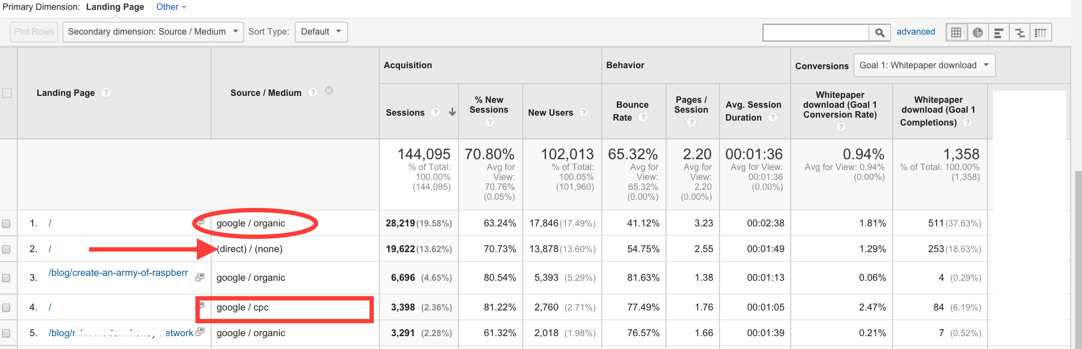
Now you can see in this picture we have discovered that my client’s homepage is the #1 landing page for organic, direct and (shockingly) CPC traffic. With this report you can trace back homepage landings directly to conversions. If you wish, you can focus on new visitors only by adding in a segment at the very top of the page (click “+ Add Segment” -> check “New Users” -> click “Apply”) .
What KPIs should you look for?
Besides the usual “make a good first impression” rhetoric that your mommy taught you, there are some actual KPI’s that trump whatever touchy-feely/warm n’ fuzzy feelings you want to convey with your homepage.
KPI’s that you want to see for your homepage are: a low bounce rate, low time on page (not time on site), and a high number of whatever conversion goals you decide to set up.
Bounce rate and time on page are usually considered vanity metrics, but for the homepage they are key indicators of whether or not your homepage is doing its job.
You should really shoot for a homepage bounce rate of lower than 40% but closer to 25%. Here’s some bounce rate benchmarks to check out.
Time on page is more important than bounce rate for your homepage and will probably be positively correlated with bounce rate anyway. It takes about 2.6 seconds for visitors to form their first impression of your site. And according to MarketingExperiments, most of the gains they get are from optimizing the first 7 seconds of a website visit. But the sweet spot for the homepage time on page is around 2.6 to 4.6 seconds. I start to worry if a user can’t evaluate your UVP and click on something in 5 seconds.
These KPI’s will aren’t ironclad, in that, if they’re exactly “right” it won’t necessarily translate into sales. The most important KPIs are always conversion goals that fit in with your particular businesses goals. (More on this later.)
The ultimate goal for your homepage, no matter what cohort/source/segment you optimize for is:
A. Get your visitor one step closer to a conversion. (More on this later too.)
B. Don’t lose your visitor to cyberspace.
By reducing bounce rate on your homepage you gain a MICRO-micro-conversion and get a customer to start exploring all the different parts of your site. The faster you can get your customer to the next page the less likely they are to start deviating from your highly engineered conversion steps. (Thus, reducing the time on your homepage is a good idea.)
Here’s an example:
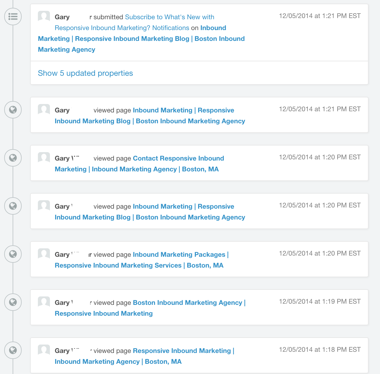
This example is from the first session logs from a visitor that visited via a Google search as it appears in HubSpot.
As you can see, Gary landed on the homepage and then clicked around to our about page, pricing page, blog, contact page, then back to the blog where he proceeded to sign up for blog notifications (one of our conversion goals).
A session like this is pretty typical, and shows the importance of getting a visitor off the homepage and deeper into the site.
As a reader of the Kissmetrics blog, you’re likely familiar with the concept of micro-conversions. Quick refresher: a micro conversion is a smaller conversion than your main conversion goal. In other words, you get somebody to say yes to a smaller request, first, before making the sale. The more micro conversions (getting a small yes) the higher the chances you have of making a big conversion (turning into a paying customer). Getting a click-through from the homepage to a deeper section of your site is what I like to call a MICRO-micro-conversion (redundant, I know). Getting that first click is the only way you’re going to see any business from visitors landing on your homepage.
But what if your site does not fit the “top heavy” pattern I mentioned at the outset. Should we care about MICRO-micro conversions when your homepage is not your site’s main landing page?
When your home page is the most popular page in your site but not the most trafficked landing page
The second type of websites I see are “long tail” websites — where more traffic lands on pages other than the homepage. For example:

This site only gets 13% of its visitors landing on the homepage, with 87% of its traffic landing on other pages (mostly individual blog posts). In this case, the homepage plays a much different role in your conversion funnel. Let’s take a look at some Behavior->Behavior Flow charts (select landing pages) to see what’s going on:
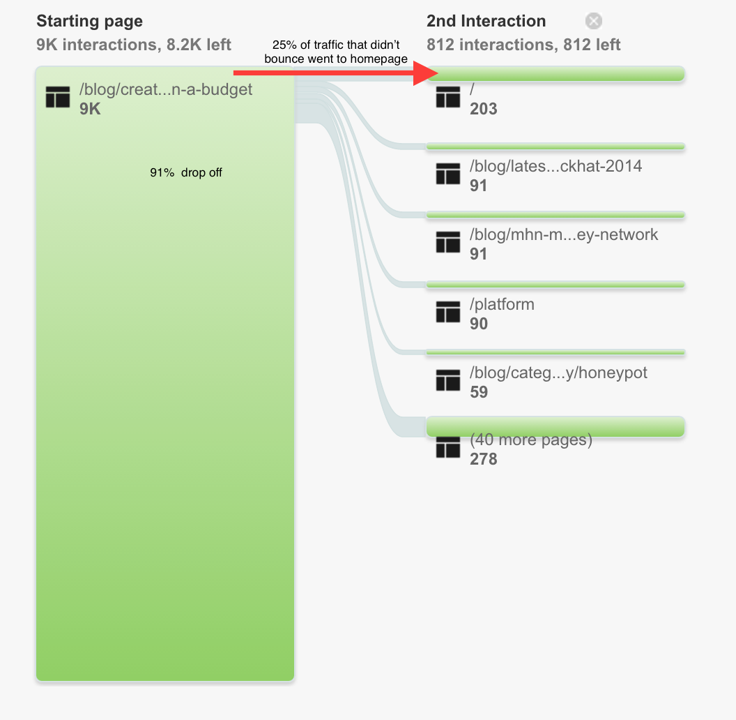
Here’s a view of the behavior flow chart that you don’t usually see. That’s because the default view of the behavior flow chart is set on “Automatically Grouped Pages”. Switch it to pages and events by clicking the drop down.

In the flowchart above we’re looking at visitors that landed on a blog post. 91% of the traffic dropped off, but what about the people stuck around? They changed from “Googling mode” to “let me check out this site mode” (or if you prefer: “that article was cool let’s see if the company who produced it is cool too mode” or possibly “they mentioned their product in an article about the problem I’m currently researching, maybe it’s a solution mode”).
As you can see, 25% of the traffic (that didn’t drop off) clicked through to the homepage as their second interaction after landing on the blog post.
The pattern of folks clicking through to the homepage holds true for virtually every “long tail” website that I’ve seen in my career. 10- 50% of visitors end up on the homepage as the first page after landing on a page that isn’t the homepage. (If they don’t bounce.)
Why do 10-50% of visitors end up on the homepage as their 2nd interaction?
Everybody puts a link to their homepage in the top left corner (usually in the form of a bright and bold logo). When a user is not presented with any other bright and bold call-to-actions, they default to the bright and bold logo occupying the most prominent real estate on the page.
Key takeaway #1: An unusually a high percentage of the people who don’t bounce off of your landing page click through to your homepage.
As a result of this key takeaway#1, you must be aware of the transition from the initial landing page to your homepage (just like you have to be aware of “ad scent”). If your landing pages have content or design elements that don’t match up with your homepage (and UVP) you’ll artificially inflate the amount of visitors who drop off.
But what about the other 75% of users who stick around but don’t click on your homepage? Lets look at the behavior flow chart again:

13% of visitors who didn’t drop off from their first interaction ended up on the homepage for the second interaction (mostly made up of visitors who didn’t click through to the homepage the first time). And the same goes for the third interaction as well.
I’m painting a picture of user behavior in “the wild”. We’ve all been programmed to make a stop on the homepage when we are interested enough in a website. I bet you’ll catch yourself next time you do it.
Here’s the kicker… these stats are for new visitors. What happens when somebody returns to your site by Googling your brand? They land on the homepage. What happens if they subscribe to your email list the first time? They get an awesome email from you promoting your latest blog post…they click through to your blog post…then end up on your homepage. What about an avid reader of your blog… do they end up on your homepage the 5th time they visit your site? No, they’ve already seen your homepage (multiple times).
Key takeaway #2: Pretty much everybody who is a potential customer will visit your homepage at some point before they make a purchase from you even if you have a “long tail” website.
The other option “long tail” websites have is to play around with not making your logo the brightest and boldest call to action on the page. Placing prominent call to actions on the landing page will take visitors to pages of your site that have a higher conversion rate instead of the homepage. Done right these CTAs will prompt them to get out of “Googling mode” and get them into “let me check out what’s on the next page mode” more effectively than leaving users to their own devices. That way, you can worry less about how the content on your landing pages connects back to your homepage. Instead you can focus your effort on making the call to action as relevant as possible to the intent of users coming to your landing pages.
Everybody sees your homepage and it has an effect on your conversions
Ah ha, you say! Redesigns are worth it! Not so fast…
You can experience a lift in conversion rates with a redesign, especially if you have a “top heavy” website. You can get a lift if you have a “long tail” website too. But, you have to remember that people will not follow the exact path you have in mind (when you give them the option).
Side point: You could introduce a path that limits the options of your visitors (i.e. don’t include a navigation bar, links or other clickable options.) You already know to do this for your checkout pages… but you may want to use the concept of limiting options as the starting point for experimentation ideas.
When you have a website with expected navigation — which you should most of the time — there is lots and lots of variance. In fact, the more options you give to customers and the more diversity of traffic sources you have, the more variance you get when it comes to the path visitors take. That variance dilutes your homepage’s conversion rate.
This variance should be considered when it comes to your decision of testing out a new homepage. Check out this handy dandy chart showing the base conversion rates of different pages of a representative website:
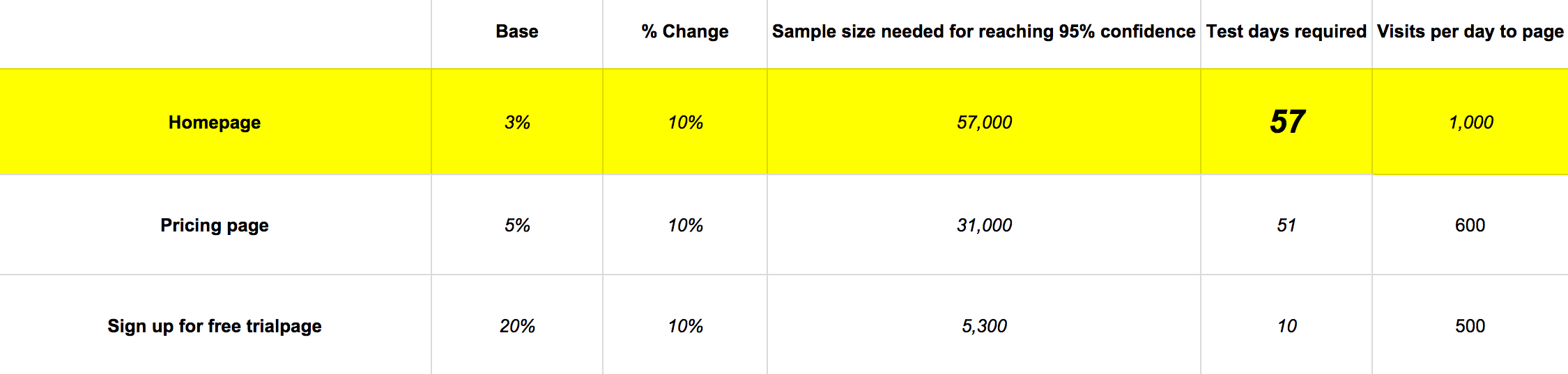
This chart says a lot, but notice how the homepage almost always has a lower conversion rate than other pages on your site.
The reason why the homepage has a lower base conversion rate than your signup page, is because people who aren’t interested in signing up don’t click on the signup page.
But on top of that obvious reason, you have all different types of people visiting your homepage all with:
- different levels of exposure to your brand
- different stages of the buyer’s journey
- different buyer personas
- different traffic sources
….thus more variance as to how they are going to explore your site. So no matter what, redesigning your homepage is going to have less of an effect on your conversion rate than redesigning another page that is “closer” to your point of conversion.
What should you change on your homepage to improve conversions?
Ah hah, you say! Redesigns are not worth it because the conversion rate will always be low! Not so fast…!
Just because the conversion rate of your homepage is always going to be lower than other parts of your site doesn’t mean it doesn’t play a significant role in the overall conversion process of your customers.
Almost every person who will buy from you will see your homepage.
Does that mean the homepage is a good place for:
- Announcements?
- Sign up forms?
- Coupon announcements?
- Your UVP?
What about making your homepage into one big sales page? Or explainer videos? And so on?
As usual, it depends. On what? Your ultimate goal.
You must think critically and holistically about the business goals you are trying to achieve with your website. Pretty much all websites are driven by 2 primary goals : making a sale or generating a lead.
Before somebody gets to those conversions (becoming a customer or becoming a lead) the customer needs to have enough information. Your homepage is the “gut reaction” piece of the information puzzle.
Are announcements going to give non-customers information that leads them to a conversion? No.
Is having a signup form on your homepage going to get people to sign up? Probably not. (It could if your product is simple enough, but only after giving the information necessary for conversion.)
Are coupons going to entice folks to action? Not if they can’t find the information they need to understand what you’re selling.
Is your UVP going to help move visitors closer to buying? Yes! A well-crafted UVP is what should go on your homepage. But is that the only thing you need? Are you finished optimizing if you already have a UVP on your homepage?
What elements are essential to your homepage?
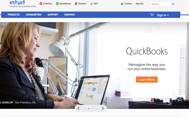
Number 1: an exquisite UVP.
Number 2: a single call to action that is an extension of your UVP.
After you master these two things, everything else will have only an incremental impact when optimizing your homepage.
Essentially, it’s your homepage’s job to get people off the homepage and onto an education page and your UVP should give people enough information to click the call to action that takes them there.
In addition to the UVP and singular call-to-action, you should consider what type of business you have. If you have an e-commerce site, a call-to-action that leads to an “about” page won’t give your customers the information they need to buy from you…they want to see the exact products you have in stock…so in addition to your UVP, your call to action should be a prominent search box or filtering options. Or if you are a brick and mortar restaurant, you’ll have your phone #, hours (delivery hours too!), and call-to-action that leads to your menu. Be smart about it!
Here are some examples:
Nothing below the fold will have a noticeable effect on the conversion rate.

Your call to action could be interactive.
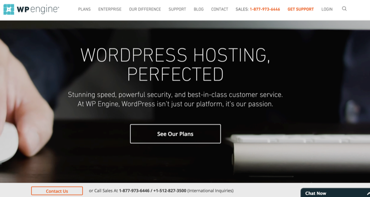
Your plans and pricing could be the education page you want to guide customers to. (Notice the prominent phone number too.)
If you are not getting engagements (clicks) on your call to action, there are 3 options:
- There is something wrong with your UVP. (Keep testing.)
- The wrong people are coming to your website. (You’re attracting people who are not interested in your product.)
- Nobody wants what you are selling. (Your product is just terrible because you didn’t validate that the market actually wanted it.)
How to test your homepage
So, finally, are redesigns worth it? They can be. If they are:
- Radical enough to get a big change.
- Fast/easy/cheap enough to payoff.
But for my buddy who spent 100 hours redesigning his homepage, it probably isn’t worth it. The same goes for my client (the one who spent 6 months doing hundreds of revisions) — the effect on the conversion rate was minimal.
Homepage A/B tests must be radical enough to get a big change
Take a look at the conversion chart again and note that the % change in base conversion rate is 10%. (In general 10% is a pretty high lift in conversions.)
What this means is that the change you make on your homepage will have to improve conversions by 10%. Testing the background color of your homepage or other smaller elements probably won’t get a 10% lift… maybe 1 or 2% but let’s say we aim for a 4% lift, let’s look at the chart to see what happens:
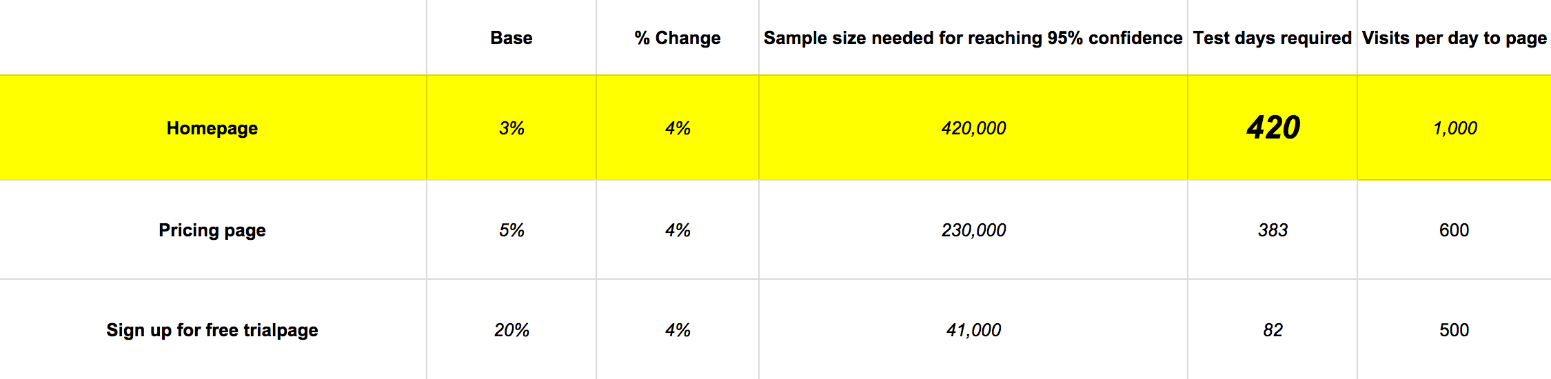
Wow! The sample sizes you need are huge. For a low traffic site, you’ll never be able to tell if your redesign was worth it unless you make big changes that could lead to big changes in conversions.
Homepage A/B tests must be fast/easy/cheap enough to payoff
Let’s do some quick math:
- 10% of 3 = 0.3% lift & 3 months of testing
- 10% of 5 = 0.5% lift & 1.7 months of testing
- 10% of 20 = 2% lift & 10 days of testing
Since the homepage has a lower starting percentage, you have to make your tests with fewer resources if you expect them to payoff.
Now let’s translate those percentages into sales for our imaginary site:
- 3 more conversions per day from a 10% lift on the home page
- 3 more conversions per day from a 10% lift on the pricing page
- 10 more conversions per day from a 10% lift on the free trial page
All of the sudden testing the homepage seems a lot less sexy. The opportunity cost doesn’t lie.
Now you should be painfully aware of the fact that your homepage should be focused on getting your visitors to the important pages of your site. Which is why you need to get your visitors off your homepage and onto the pages that actually matter (the page where you can sell something, or collect lead information).
And spend more of your time optimizing your checkout/ sign-up process.
Conclusion
In short, your homepage is like a pair of sunglasses through which your customers view your product, site, and company. You want to get people off your homepage as fast as possible — deeper into your site — if you want to improve conversions. But only start optimizing the homepage after fixing the pages deeper into your conversion funnel first.
If you insist on working on the homepage, focus on your UVP and call-to-action. Test to see if you can get MICRO-micro-conversions by measuring CTR on the call-to-action as a gauge of how well your homepage is doing its job.
Summary
We’ve gone through a lot. Here’s a recap:
- There are 2 types of websites – top heavy and long tail.
- Top heavy sites (the homepage is the most trafficked landing page) – the homepage is super important.
- Long tail sites (other pages make up the majority of landing page traffic.) – the homepage is not as important, but still significant because it’s often the 2nd interaction with your site.
- The job of your homepage is to get visitors off the homepage as fast as possible deeper into your site.
- Low bounce rate (under 40%), and low time on page (under 5 seconds), will tell you if your homepage is doing its job.
- A/B Testing your homepage’s conversion rate requires a large sample size to reach statistical significance. If you already have test data on you can plug in the numbers here in this statistical significance calculator.
- You should do big tests on the UVP and CTA that are featured on your homepage and measure the CTR to see if your homepage is working.
- Is doing a redesign worth it? Yes, but only if you have optimized all of the deeper (higher conversion) pages first and spend few resources on it.
About the Author: Kalki Gillespie is a digital marketing consultant and brain cancer survivor who works at the inbound marketing agency: ResponsiveInboundMarketing.com. Connect with him on LinkedIn for more insights.
